
How to Create Notion Charts
Notion has established itself as a powerhouse in the world of productivity and organization. However, it offers more than just task lists and note-taking. Adding Notion charts to your pages can elevate your data management game, providing visual insights and enhancing your decision-making process.
Why Use Charts in Notion?
Charts are more than just visual decorations. They’re dynamic tools that allow you to present data in a more comprehensible and insightful manner. They’re not limited to specific fields either – whether you’re managing personal finances, tracking project progress, monitoring fitness goals, or creating informative presentations, charts can add an extra layer of understanding to your data.
Creating Charts in Notion: Your Options
Notion offers a range of options for creating charts:
1. Built-In Chart Functionality
Notion comes equipped with its own charting feature. It’s perfect for quickly creating simple charts. Just select the data you want to visualize, click on the “Insert Chart” button, and voilà – you have a chart. While it’s easy to use, it may not provide extensive customization options for more complex visualization needs.
2. Third-Party Chart Tools
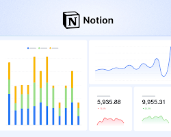
For those seeking more customization options, third-party chart tools are the way to go. These tools can offer a wider range of chart types and more control over formatting. One popular tool is ChartBase, which seamlessly integrates with Notion. With ChartBase, you can create various charts – from bar and line charts to pie charts – and customize them according to your preferences.
3. Crafting Your Own Custom Charts
Feeling adventurous? You can create your own charts from scratch in Notion. This approach provides the utmost flexibility, allowing you to design charts that precisely match your needs. To start, use Notion’s block editor to set up a table or a list. From there, utilize formatting options to style your chart, add labels, and insert titles.
Tips for Crafting Effective Notion Charts
Creating effective charts involves more than just selecting data and generating visuals. Here are some tips to ensure your charts convey the desired message:
1. Prioritize Clarity in Labels: Clear labels are crucial for understanding the data being presented. Ambiguous or complex labels can confuse the viewer.
2. Consistent Formatting: Maintain uniform formatting throughout your charts. Consistency enhances readability and aesthetics.
3. Readability and Comprehension: Choose chart types that best represent your data. A cluttered chart can obscure insights, defeating the purpose of visualization.
4. Regular Updates: If your data changes over time, ensure your charts reflect these changes accurately. Outdated charts can lead to incorrect interpretations.
In essence, Notion’s charting capabilities are a valuable asset that can transform your data into meaningful insights. No matter your field or purpose, these visual tools can enhance communication and facilitate data-driven decision-making. Whether you’re a student, professional, or simply an individual with data to present, mastering Notion’s charting features can empower you to take your data to the next level. So, why not dive in and explore the world of Notion charts today?
Recommended For You